Boundary Perception Of Modern Apartment Space
Location : Viet nam - HCM
Project year : 2020
Area: 93sqm
Project year: 2020
Contractor: Trung Long Company
All plans, illustrations and visualisations © PRAXIS 324
All photos: © Praxis324
Due to responsory of rapidly increasing housing-need in HCMC,Vietnam, together with some economic strategies of many real-estate corporations, high-rised apartments grow speedily. As certain result, miss-understanding on definition about “modern life style” / “comfort/ convenience” / “house-buying-social behavior” spread, which gradually change the citizen’s desire on real-value of living-quality.
1. The usual architectural conditions of appartment
- It is stereotype architecture solution that gives many restricts for living spaces, which composed by many same house-modules -with same small rooms division, same closed spaces well-prepared for air-conditioning, same minimized balconies, bounded-freedom inside walls and glass doors… Character of inside spaces is controlled by high-building-standards, on mateiral, structure and technique system…
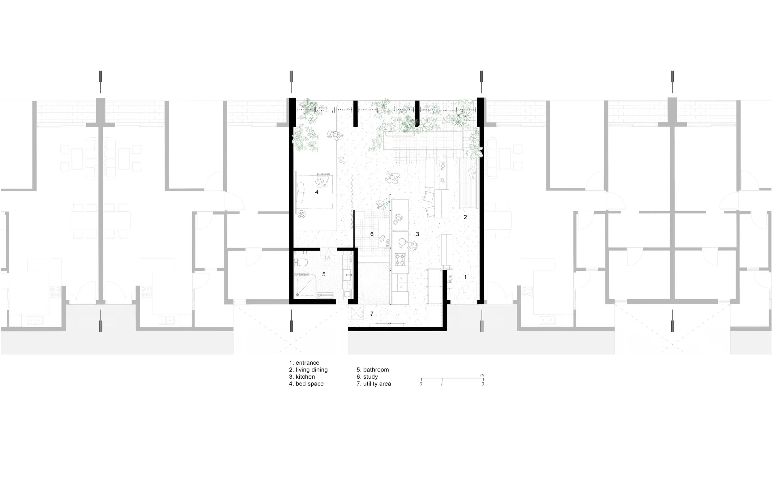
- As an example, our project – one apartment unit within 100 squaremeter. With 3 collumn spans of original building’s structure, appartment space is divided into 3 spans of elevation: one for narrow and deep living room, other two for bedrooms with toilets.
The separated spaces connect through one small corridor and become isolated area for each family member physically and psychologically.
2. Architect do interior design:
- Being conscious about that context’s restrictions, taking advantage of potential existed-architectural-elements for new experience/ new chance of spaces is important for design solution.
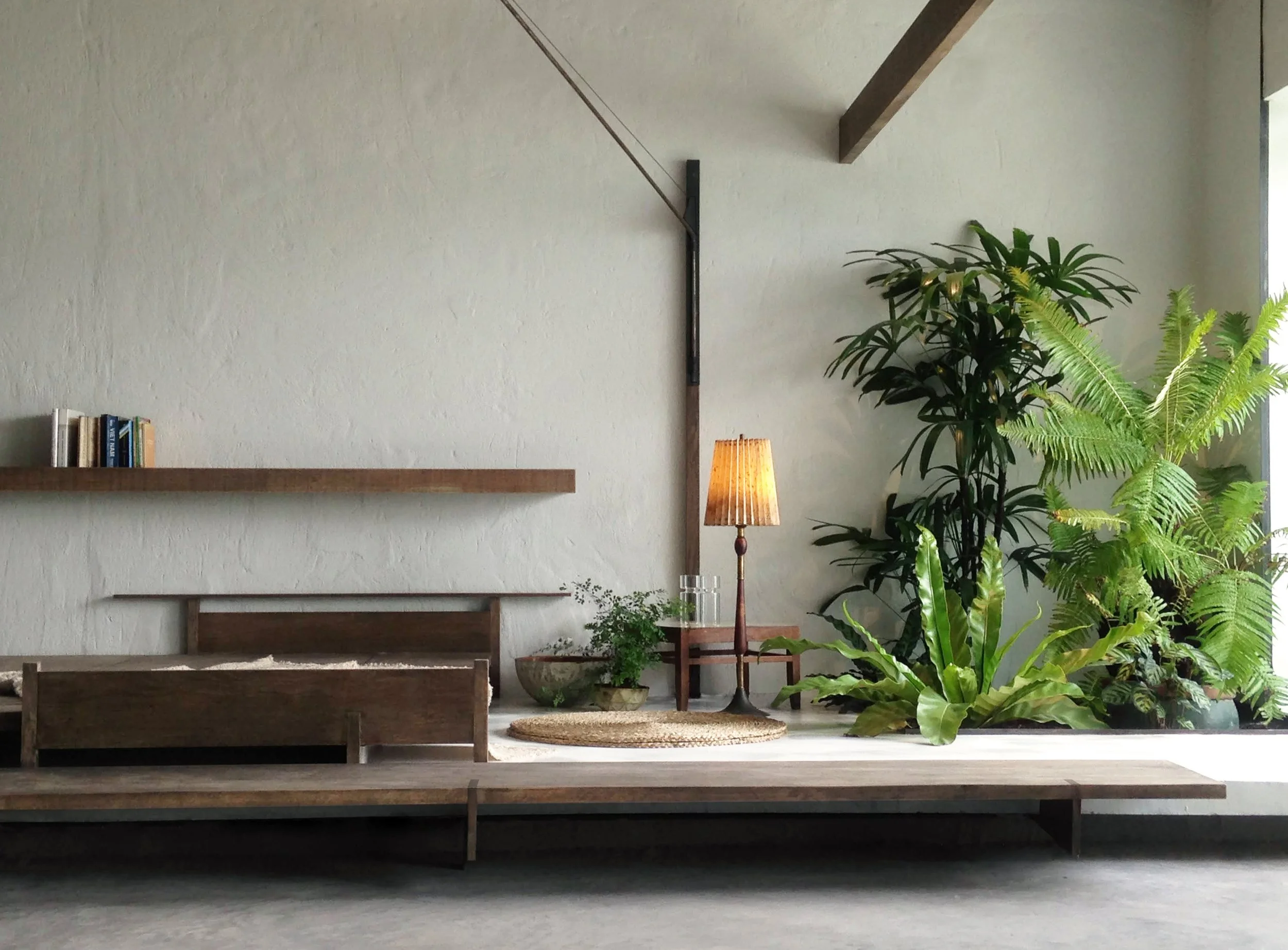
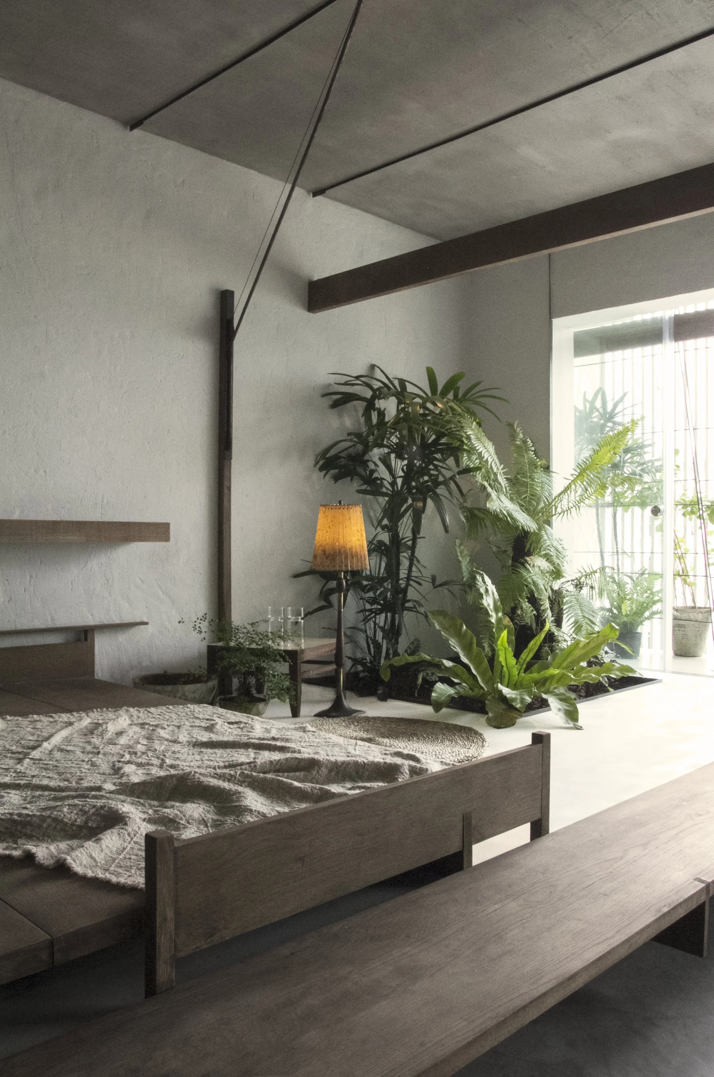
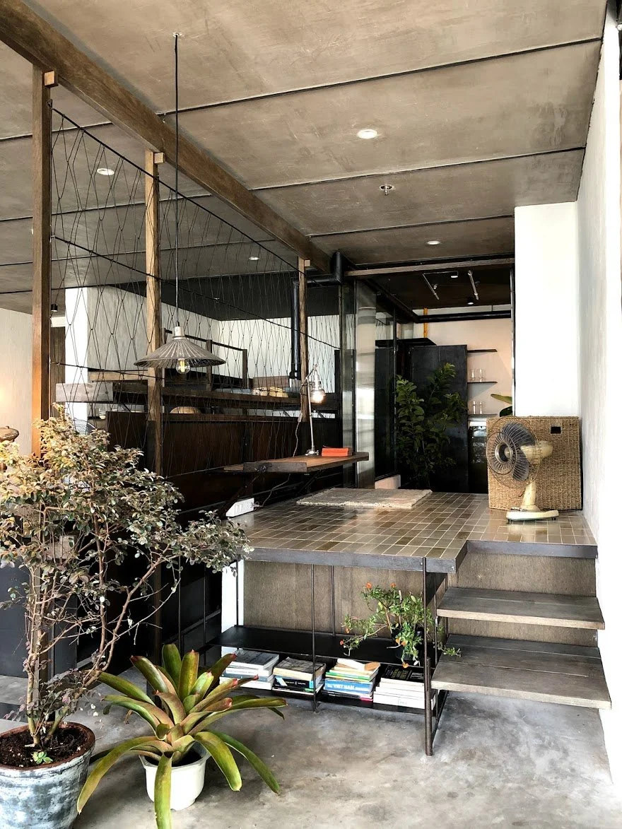
To break the rule of building’s 3 spans 3meters by 3meters, one low wooden is added. Together with 1.5 spans length of this eave, one low steel bench is layout under. This set of elements changed the proportion of space, gave new horizontal direction of view frame and suggested people’s sitting-down-behavior of usage.
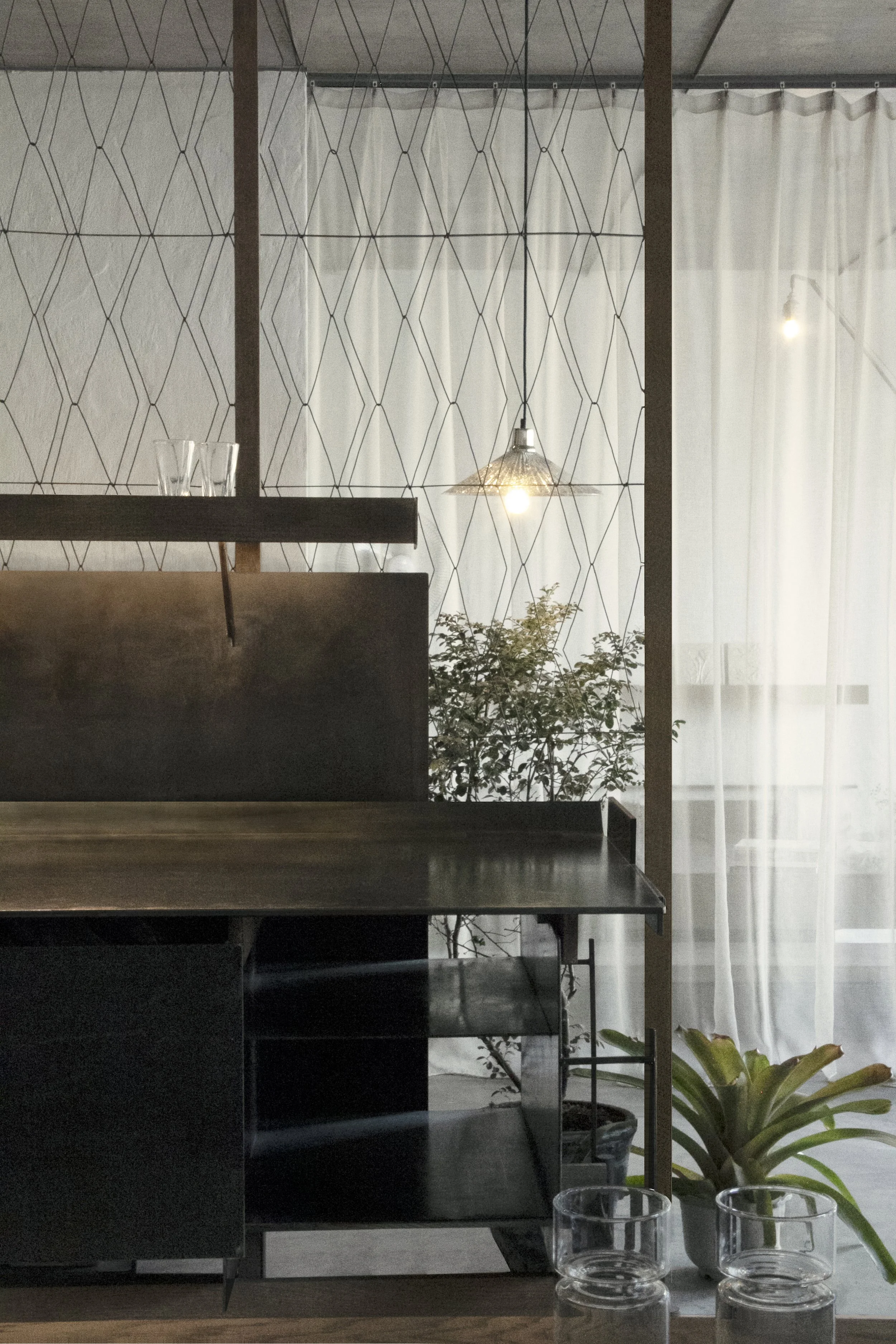
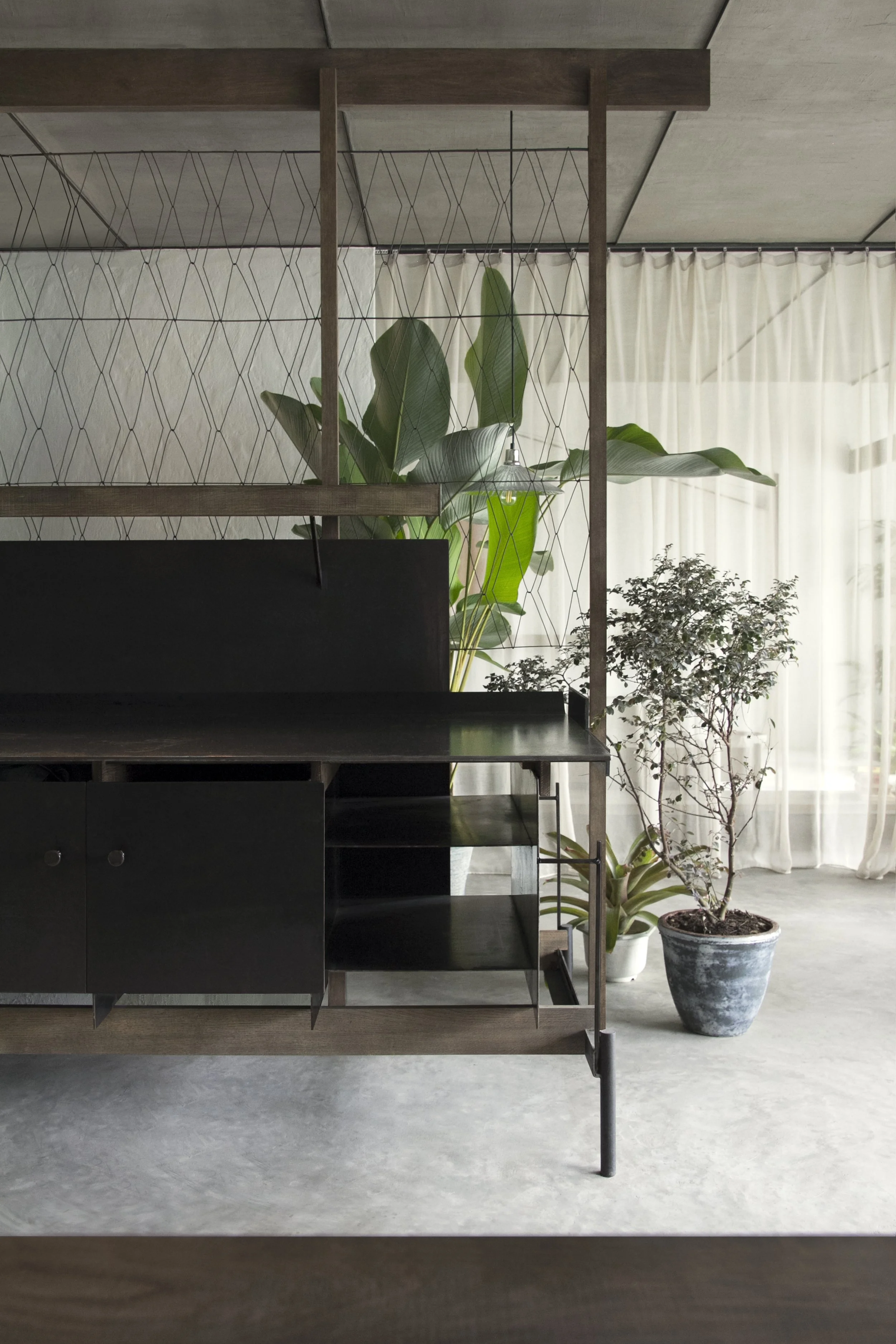
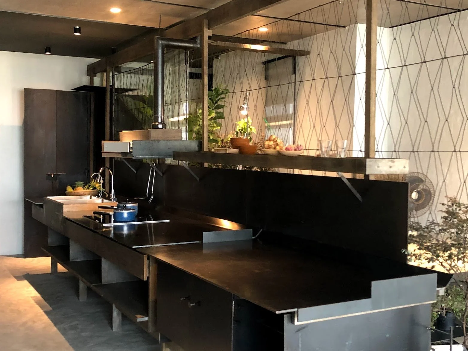
Besides, to break the original sign-view – framed by glass handrail, walls, ceilings of small balconies, we installed one steel mesh system along 3 spans elevation. By being rotated 75 degrees, the mesh surface become new fragile layer – which changed the direction of view frame, more look up, more emphasize into continuous horizontal elevation, blur the strong existence of 3 repeat collumn spans.
- Interior elements and architecture elements are arranged at the same time, for sensitively matching and supporting each other. Therefore, we want to design each furniture, with priority consciousness about : architectural spaces’ character, interior elements’ target and role, inspiration from geometry principles, together with logical base -spaces’ original structure.
- From our perception as architect – not interior designer, we don’t try to find suitable architectural context for ready-made own-characteristic furniture products, to put in, or we don’t consider interior elements as additional decorative things with sentiment artistic principles.
3. Richness and quality of living space -in modern appartment: includes 3 points below:
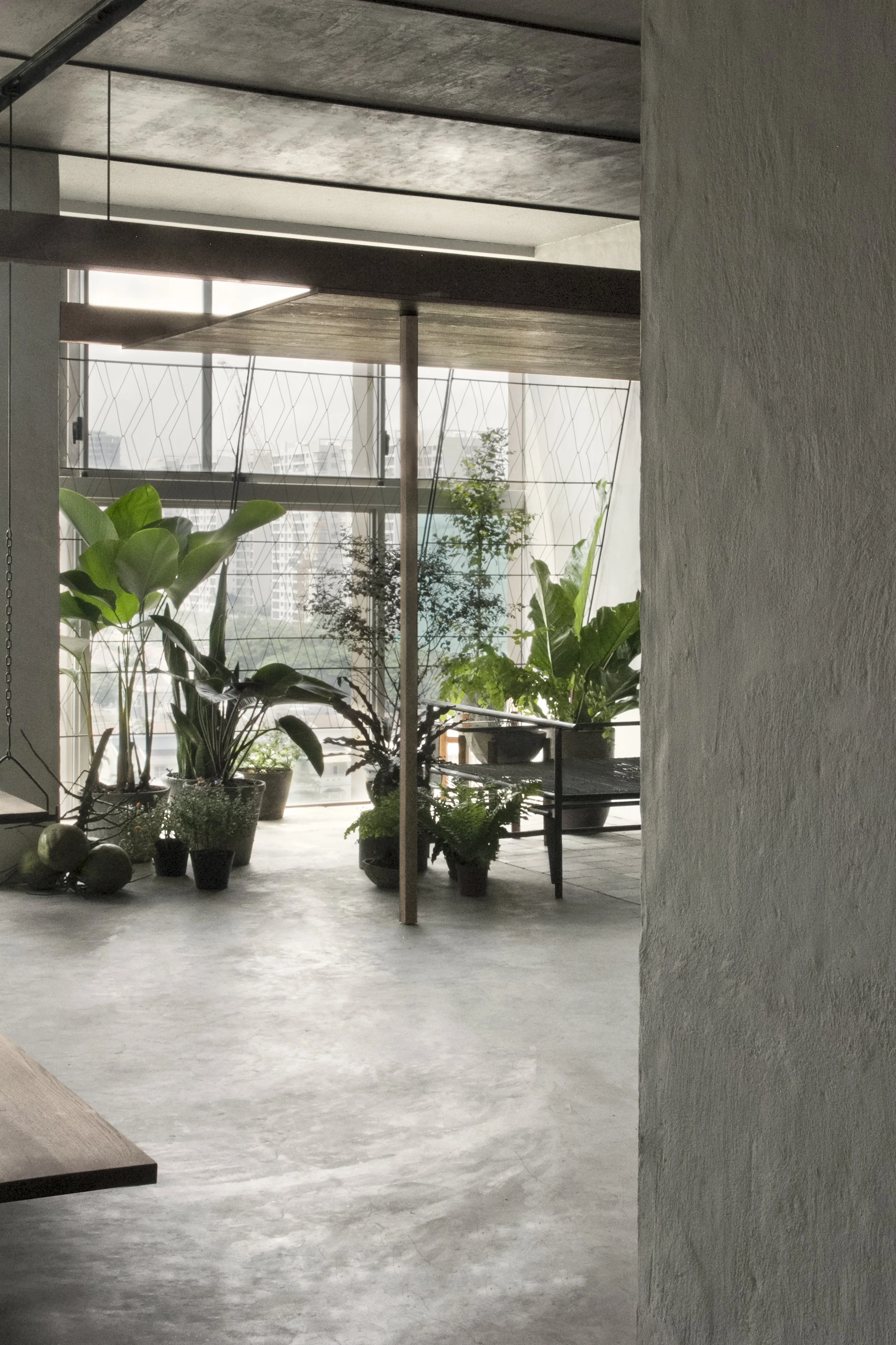
. Firstly, letting greenery join into daily living activities, would increase the value of living space. Practically, area used for garden becomes so luxurious in each modern apartment unit, since squaremeter-number is understood as value for real-estate- business. We decided not only increase greenery area, but also increase the possibility of human-interaction with this garden.
. Secondly, we focus on the border line between indoor-outdoor spaces, instead of increasing “indoor – squaremeter-number” – which usually defined as posessive functional area.
By breaking this border, spaces somehow increased more layers, outdoor-objects join into indoor-objects and create interferential layer- where space extends continously and more activities are stimulated.
Balcony floor material is changed into precasted concrete tiles which come and melt in concrete indoor-floor.
Together with tiles, greenery pots, wood eave and transparent steel bench bring outdoor atmosphere more inside, suggest human activities more outside. At this interferential layer of space, sunlight sparkle on steel mesh, go through the bench, play on tile-floor, and people enjoy the garden under low eave.
At the same time, white epoxy floor extend till end of balcony, where planting coming in and activities on floor coming out.
. Thirdly, we believe that emotions from material and hancraft elements can enrich the daily living atmosphere. Different from industrial material, the random rate of each handmade units emphasize on fragile, energetic and lively character of elements.
These emotional materials of interior elements give contrast to modern products - which head for efective production but at the same time flatten the vivid of daily living.

